4-9. Viewing results and drawing curves
4-9-1. Displaying alphanumerical results
4-9-2. Viewing 1D signals (vectors)
Using the View/t module
Using the View-zoom/t macro
Other 1D viewing modules
4-9-3. Viewing 2D signals (matrices, or clusters of vectors)
Definition of "Matrices" and "Clusters of signals"
Macros for viewing 2D signals
Viewing infinite 2D signals by block
4-9-4. Making temporary hardcopies of results
Making temporary hardcopies of alphanumerical results
Making temporary hardcopies of graphical results
4-9-5. Creating custom displays using elementary drawing modules
Elementary drawing modules
Reticule options
Example 1 : Drawing a line between two points
Example 2 : Drawing several lines at a time using vectors
Example 3 : Drawing several lines at a time (2)
Example 4 : Drawing several lines at a time (3)
Example 5 : Drawing a line between a fixed point and a reticule
Example 6 : Dividing a graphical plane into 4 sub-planes
Example 7 : Dividing according to a variable - Viewing matrices of 1D curves
Example 8 : Superimposing graphical elements
The Outputs section of the MUSTIG library contains several macros for viewing results and drawing curves. Signals depending on one or two variables (i.e. vectors and matrices) can directly be displayed. Signals depending on a larger number of variables can be viewed by carrying out slight changes on the existing 2D modules.
4-9-1. Displaying alphanumerical results
Several modules are proposed in the Outputs section of the Library for displaying numerical results :
|

|
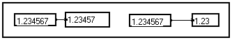
General purpose alphanumerical display module. Vectorial numerical data are displayed as a list. The width of the module controls the precision with which the numbers are displayed. You may resize this module to change the precision or make room for other data.
The samples of a vector are displayed as a column :
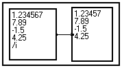
If the data depend on more than one variable, the result is still displayed as a vector and the dimensions are interlaced. You cannot control in which order the elements are listed :
If the amount of data to display is such that there is not enough room on your screen, you may either select portions of data (see Changing the length of a variable), or select the ?????? module and hit Alt+M to change it into a macro. Then, double-click on the module : a new window featuring scroll bars opens and allows to view all the data.
The ?????? module should not be used to view a huge amount of data : select a portion of the data before, or use the graphic display macros instead. |
|

|
Formatted vectorial numerical display macro. Displays the elements of a vector in a separate window with scroll bars, beside the indices. Allows to view a larger number of data, like in the program below :
|
|

|
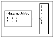
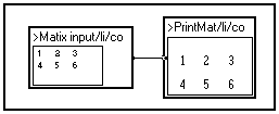
Displays a 2D signal as a matrix. In the example below, the display window has been included into the front panel for convenience (see Creating images of macros).
|
|

|
Displays a 2D signal as a formatted matrix. In the example below, the display window has been included into the front panel for convenience (see Creating images of macros). The display format can be changed by double-clicking on the module. |
|

|
Displays a 2D complex signal as a matrix. |
4-9-2. Viewing 1D signals (vectors)
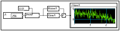
Using the
View/t module
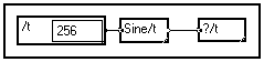
The basic macro View/t in the Outputs section of the Library allows to display a signal depending on variable /t. The name of the variable may be changed by Shift+Ctrl+Clicking on the box.
To view a signal depending on one variable, just connect the View/t macro to the signal :
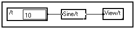
In the above example, a 10-sample signal is created and loaded with values from a sine wave. To display the signal, as always in MUSTIG, just right-click on the View/t module : a new window opens and the curve is drawn :
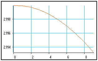
This is the default configuration : black axes with a light-blue grid. The curve is drawn with a thin orange line and the normalization is such that the curve fills all the space.
Adjusting the axes
:
Move the mouse cursor into this graphical window while hitting Shift+Ctrl. Five crosses and one rectangle appear. They are mouse-sensitive reticules which allow to adjust several elements of the graph :
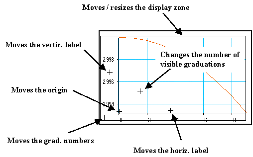
To get information on what a reticule does, click on it and ask for the online help (Alt+H shortcut).
To move a cross reticule, just click on it to select it and move it using either the mouse or the keyboard arrows.
To move the rectangle, click on its border to select it and move it using either the mouse or the keyboard arrows. You may resize it by keeping the Shift key pressed while moving.
When you move a reticule, the curve is generally automatically recalculated to allow real-time feedback. If your signal is very long this may be awkward and you may want to temporarily select the Axes only option by double-clicking on the View/t box.
Drawing options
:
You may change the look of the curve to taste by double-clicking on the View/t box. A front panel opens and allows to change several parameters :
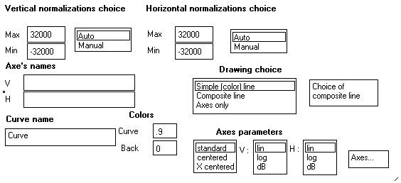
The available options are :
|
Vertical normalization |
Sets the extreme values on the vertical axis. You may change them and click on Manual to validate them. You may come back to automatic normalization by clicking on Auto back again.
Note : Automatic normalizations should not be used to view infinite signals (use specific macros from the Outputs / Real Time section of the Library instead). |
|
Horizontal normalization |
Sets the extreme values on the horizontal axis |
|
Axes names |
Puts labels along the axes of the graph (default = no labels) |
|
Curve name |
Changes the name of the graphical window (default = "Curve") |
|
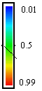
Color of curve |
Sets the color of the curve when the Simple color line option is on. Must be a real number between 0 (transparent) and 1 (black) :
|
|
Color of back |
Color of the graphical window background. Same scale as for the curve color. |
|
Axes parameters |
Sets the type of axes and the scale (linear or logarithmic) on both axes. Default configuration is standard axes and linear scales on both axes. |
|
Axes… |
Double-clicking on this image box opens a new window from which you may change the colors of the grid (default=0.2) and of the curve display zone (default=0), the maximum number of graduations (default=20), etc. |
|
Drawing choice… |
Simple color line (default)
Displays the curve with a thin color line
Composite lines
Allows to set the type, color and thickness of the line by double-clicking on the Choice of composite lines image box. Also allows to display symbols of various types, sizes and thickness at each data point. Very useful when viewing small vectors.
Axes only
Displays only the axes. You may want to check this option to comfortably adjust the axes if your signal is very large and takes a long time to display. |
These options, plus the possibility of adjusting the axes, allow to build beautiful custom graphs. You may add text boxes in the graph using the Alt+T-click shortcut.
Tips
:
Ideas of custom graphs made by just changing the options of the View/t macro are shown below :
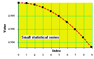
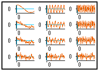
Viewing of small statistical series :
The Composite lines option has been checked, so that the curve is drawn with a thick, dotted red line, square symbols being drawn at each data point. Labels have been added on both axes. A text box has been created in the graphical window. The background color of the display zone has also been changed. Lots of graduations are visible.
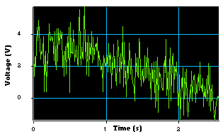
Oscilloscope-like curve :
The curve is drawn using the Simple color line option. The color of the curve is 0.6 (green) and the axes background color is 1 (black). Labels have been added. Few graduations are visible.
- A graphical window may be "Drag&Drop"-ed into Image windows (see Creating Image windows) to create control panels for your applications. It can also be included into the front panel of the - previously unlocked and resized - View/t module (see Creating an image) in order to create pre-viewing macros :
- If the View/t macro is used for viewing a signal depending on variable t plus other variables, the mechanism of automatic expanding of operators along the lacking dimensions is activated : all the curves are drawn successively and are superimposed. The result is generally not well readable, unless manual normalization is used. It is recommended to use the 2D viewing modules instead (see Viewing 2D signals).
Using the
View-zoom/t macro
If the View/t macro is used to view a long signal, small details of the signal may not appear, due to the limited resolution of the screen. In this case, the user wants to zoom in on smaller portions of the signal. This can be done by connecting a Part or Part_dec module with appropriate parameters before viewing the signal (see Changing the length of a variable).
A better solution to search for the most interesting portions of a signal is to use the View-zoom/t macro available in the Outputs section of the Library. If you connect it to a long signal and right-click on it to launch its calculation, you get the following window :
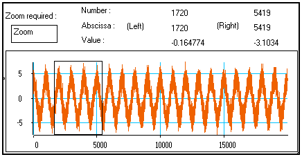
The whole signal is displayed in the window. The thin black rectangle appears only when the mouse cursor is moved over the curve. The numbers on the top part of the window indicate the position (in both samples and seconds) of the edges of the rectangle, and the value of the signal at these two positions.
The rectangle is a reticule : you may move it by clicking on it and sliding it using either the mouse or the keyboard arrow keys. You may move it either horizontally or vertically.
You may also resize it by keeping the Shift key pressed while moving the rectangle. Both the width and height of the rectangle may be resized.
The positions and values displayed on the top of the window are automatically recalculated each time you move or resize the rectangle reticule.
Using this mechanism, you can move and resize the rectangle reticule so that it frames the part of the signal you want to have a closer look at :
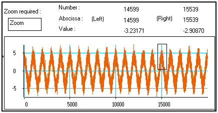
Then, right-click on the Zoom image box on the top-left corner of the window : the selected portion of signal is drawn in a new, similar window :
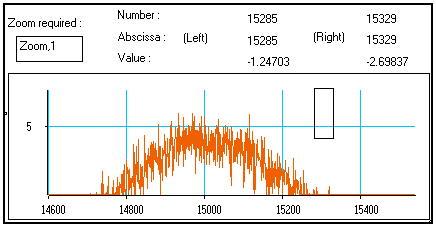
This new window behaves exactly the same way as the previous one : you may move and resize the rectangle reticule in this new window, so that is frames an even smaller portion of the signal, and ask for a closer look by right-clicking on the Zoom,1 box : a third window appears, …
And so on : only the amount of available memory limits the number of consecutive zooms that can be calculated !
Therefore, using successive iterations of the View-zoom/t macro allows to precisely select smaller and smaller parts from a long signal and display them in details.
You may change the number of graduations, the position of the labels, and the origin of the graph by moving the mouse cursor over the curve and hitting Shift+Ctrl. Three cross reticules appear and may be moved (either with the arrow keys or the mouse) to change the look of the graph (see Using the View/t macro / Adjusting the axes).
Other 1D viewing modules
Other macros are available in the Outputs section of the Library for displaying 1D signals (i.e. vectors). The viewing parameters are set by double-clicking on the box. Also check the online help of each module for more information.
|

|
Same as View/t macro, except that elements are available on the top output pin for combining several curves. |
|

|
Displays a vector of complex numbers (the real and imaginary parts are superimposed) |
|

|
Superimposes two input signals (the length and attributes of the signals must be the same) |
|

|
Displays two input signals X(t) and Y(t) as a cloud of points in a (X,Y) plane |
|
|
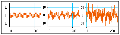
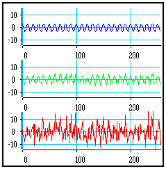
Allows to view signals much longer than the number of pixels on the horizontal axis. |
|
|
Displays the histogram of the values contained in a vector. The number of intervals can be set by double-clicking on the box. |
|
|
Displays the signal in a sliding graph, as done by cardiographs. This module is able to display infinite signals (length = -1). The larger the window, the slower the display process. |
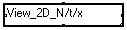
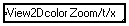
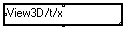
4-9-3. Viewing 2D signals (matrices, or clusters of vectors)
Definition of "Matrices" and "Clusters of signals"
By convention, a 2D signal in which both variables have a number of samples of the same order of magnitude is called a matrix. Small matrices are often displayed using the PrintMat/li/co and ForMat/li/co matrix display macros in the Outputs section of the Library. Larger matrices are generally displayed using false colors, isocontour lines, or as a 3D view.
If one dimension is much shorter than the other one, we will rather call this 2D signal a cluster of signals. Clusters may be displayed as successive 1D curves, false colors, superimposed curves, etc.
Macros for viewing 2D signals
Several macros exist in the Outputs / 2D section of the Library for displaying 2D signals. Their parameters may be changed by double-clicking on the box. Also check their online help (Alt+H) for additional information.
Like always, any curve can be displayed in an Image window or a front panel (see Creating Images and Creating Image windows). This is particularly useful when a user-friendly interface is required for your application..
|
|
Macro for displaying clusters of signals : the length of variable /x is supposed to be smaller than that of variable /t.
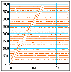
Available display types are : vertical division, horizontal division, false colors, isocontours, superimposed curves, shifted curves, shifted curves with hidden surfaces. Examples are shown below. |
|
|
Macro for displaying large matrices : the length of both variables /t and /x are of the same order of magnitude.
Available display types are : false colors, isocontours, shifted curves, shifted curves with hidden surfaces. Examples are shown below. |
|
|
Displays a matrix using a color scale. A rectangle reticule appears when the mouse cursor is over the window. It may be moved or resized to frame the zone you want to zoom in. You may then ask for a zoomed view, and so on (see Using the View-Zoom/t macro). |
|
|
Displays a matrix as a three-dimensional curve. The point of view, colors, axes and graduations are adjustable (mostly by mouse-sensitive cursors and buttons) by double-clicking on the box.
Note : A test signal is available to adjust the viewing parameters without having to recalculate the whole curve each time a parameter is changed. |
The control panel of the View_2D_n/t/x macro is shown below as an example :
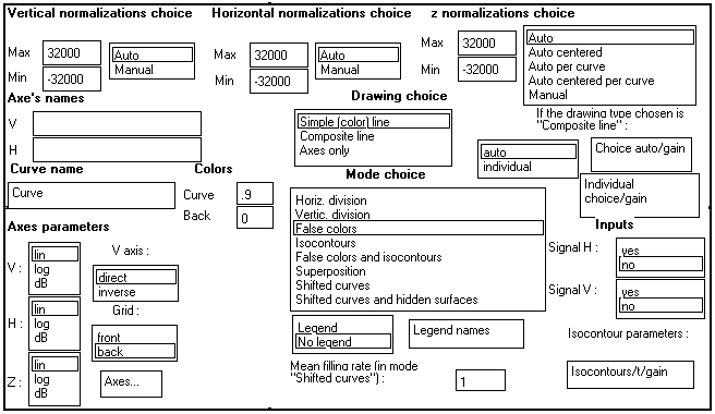
Adjusting the axes :
The same facility is available for 2D displays as for 1D displays : by pressing Shift+Ctrl while the mouse cursor is over the graphical window, a series of reticules appear.
They allow to resize and move the graph, move the origin, the labels or the graduations, and change the number of visible graduations.
Click on a reticule and hit Alt+H (online help) to get more information on what it does exactly. Also see Viewing 1D curves / Adjusting the axes for a complete description.
Creating 2D Composite lines :
|
The default line used for drawing curves is a thin, continuous color line. The color of the line and of the background are adjusted from the control panel.
Reminder : Colors are entered as real numbers ranging from 0 (transparent)) to 1 (black). Intermediate values are shown below :
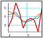
An example a 2D view using this default drawing mode and the Vertical division display mode is shown on the right. |
|
Its is possible, however, to choose other types of lines to view a cluster of signals. If the Composite line option is selected in the control panel of the View_2D_n/t/x module, the user may choose between two modes : Auto and Manual.
Automatic composite lines mode :
|
Double-click on the Auto choice box in the control panel : a new window opens to allow selecting the options of this mode :
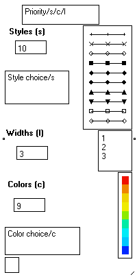
In this mode, MUSTIG uses three features to distinguish one curve from the others : Style or symbol referred to by letter /s, Width referred to by letter /l and Color referred to by letter /c.
MUSTIG performs automatic permutations of these three features to display the curves. The number of elements and the values of a feature may be modified.
An order of priority is defined on the top bow : here, /s/c/l indicates that MUSTIG first permutes the style (i.e. it uses curves of same color and same width, with different symbols).
Then, if the number of curves to display is larger than the number of styles, it permutes the color of the curves, and so on.
You may change the order into /c/s/l for instance, to permute the color first, then the style and only then the width of the curves. |
|
|
|
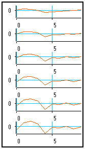
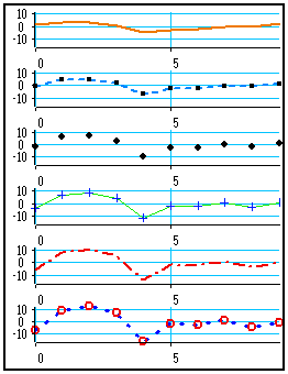
For instance, by choosing 2 styles, 2 width and 2 colors, and setting a /l/c/s priority, the six curves above can be displayed as shown on the left.
/l (line width) is the first priority, and two line width features have been selected : MUSTIG displays the first two curves by changing the line width.
/c (color) is the second priority and there are two selected colors : MUSTIG changes the color for the next two curves
/s (style) is the last priority : MUSTIG changes the data point symbol for the last two curves.
|
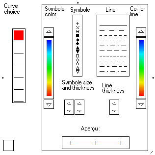
Manual composite lines mode :
If the Composite line and Manual options are both selected, you may define the style and color of each curve individually. This is more practical, and this is recommended for viewing a small number of signals.
|
Double-click on the Individual choice box to set the parameters of each curve.
On the left of the window, check boxes allow to select a curve. The number of check boxes is equal to the length of variable x (6 in our example).
1. Click on the check box corresponding to the curve you want to change the look of. Your selection appears in red (first signal in the example on the right).
2. Change the parameters of the curve : symbols, colors, style, etc. so that the curve looks exactly as you want.
3. Repeat 1. and 2. until all the curves look exactly as you want. |
|
|
|
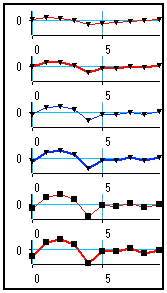
An example of custom graph for the six signals of our example is shown on the left. The look of each curve has been set following the technique described above.
Curve 1 : Orange thick line, no symbol
Curve 2 : Light-blue dotted line, small square symbols
Curve 3 : No line, medium diamond-shaped symbols
Curve 4 : Thin continuous green line, thin + symbols
Curve 5 : Thick dash-dotted red line, no symbol
Curve 6 : Thick spaced dotted blue line, thick O symbols
|
|
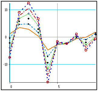
Manual or automatic composite lines are also available in the Shifted curves, Horizontal division and Superimposition modes.
Here are the same curves with the same display parameters in superimposition mode (right).
|
|
Other examples of display types
:
|
|
Horizontal division
With default line style |
|
|
Vertical division
With manual composite lines option : no symbols, thin lines of different colors. |
|
|
Shifted curves
With default line style |
|
|
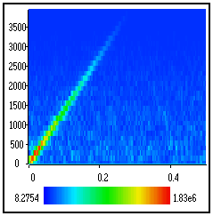
False colors
Commonly used for displaying large sparse matrices, time-frequency representations, etc. |
|
|
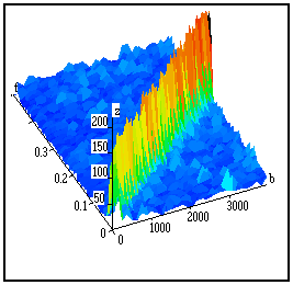
3D view
Commonly used for displaying large sparse matrices, time-frequency representations, etc.
Takes more time to calculate than a "flat" false colors 2D view.
May not be well readable if the values of the samples are homogeneous. |
Viewing infinite 2D signals by block
Macros are available in the Outputs / real time section of the Library for displaying signals already split into blocks. These macros may handle an either finite or infinite number of blocks, each of finite length. They are thus suitable for e.g. viewing blocks of acquired data in real time.
In all the macros, variable /t is the variable used inside each block, and variable /x describes the block number.
The names of the variables may be changed as usual by just clicking on the names (keeping Shift+Ctrl pressed if the box has previously been unlocked).
All the real time display macros require manual normalization values to be set by double-clicking on the box.
As a scroll is made from one block to the other, smaller display windows operate much faster.
|
|
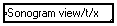
Each block is displayed as a BitMap color "slice". The color of a sample is proportional to its value. A scroll is made from one block to another, so that the display looks as a sonogram. |
|
|
Displays each block as a continuous curve, right under the previous one, so that the displays looks as a 3D spectrogram. |
|
|
Each block is displayed on one graph only and replaces the previous one. The result is an "animated" curve. |
4-9-4. Making temporary hardcopies of results
When a result (either numerical or graphical) has been calculated, one may want to save it as a reference in order to compare it to other results later on.
A first solution is to store the reference data in a file (see Writing data files), in order to read it back and display the results when required. The reference results are thus saved on the hard disk, but this technique requires the use of file read / write modules.
There is a simpler solution if the reference results need not be saved permanently.
As a matter of fact, when a display module such as ?????? or Curve (C) is duplicated using the Alt+D shortcut, its content is not reset until you connect it to the graph, or explicitly reset it using the Clear the box command. This characteristic is used for making temporary "hardcopies" of reference displays.
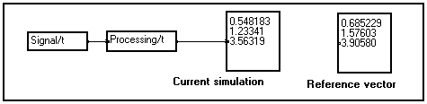
Making temporary hardcopies of alphanumerical results
Suppose you have programmed an algorithm that produces a small vector as a result. One of your runs has been particularly interesting and you want to save this reference result temporarily to compare it to other results later on :
Just click on the display module to select it and hit Alt+D to duplicate it. Drop the copied module somewhere in your program window. The values inside the copied module are not reset :
You may now continue tuning up your application : the copied reference vector will remain unchanged until you connect it or explicitly clear it using the Clear the box command :
Making temporary hardcopies of graphical results
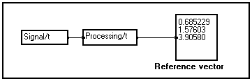
Suppose you have programmed an algorithm that produces a graphical display as a result. One of your runs has been particularly interesting and you want to save this reference display temporarily to compare it to other results later on :
|
User program producing a cluster of curves as a result. This cluster is observed using the View_2D_n macro.
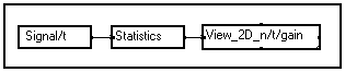
Graphical window of the View_2D_n/t/gain macro à |
|
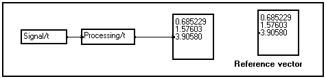
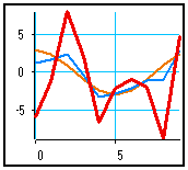
To make a temporary hardcopy of this graphical window, double-click on the View_2D_n macro : the control panel of this macro appears. Click on the Curve module located just below the "Curve name" label and immediately slide this module into your program window :
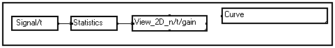
The Curve module is used for generating a graphical window from MUSTIG. When a previously calculated such module is copied or duplicated, the results it contains are not reset until the module is connected or cleared using the Clear the box command.
Thus, you may rename the copied Curve module into something more explicit :
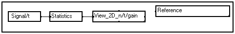
and double-click on this module. The saved results appear in a new, renamed window :
You may close and reopen this reference curve. The display will remain unchanged until the copied Curve module is connected to a MUSTIG graph or reset using the Clear the box command.
The same technique can be used for making temporary hardcopies from other graphical display modules, either 1D, 2D, 3D or custom :
- Find the Curve module (Shift+Click, see Finding matched modules)
- Duplicate or slide it into your program window
- Rename the copied module if necessary
- Double-click on it to view the saved display
Caution : As these temporary hardcopies cannot be recalculated, they cannot be printed in high resolution.
4-9-5. Creating custom displays using elementary drawing modules
All the viewing macros in the Library can be unlocked and changed to taste, thanks to MUSTIG's modularity. Tip : Use the viewing macro that suits your needs best and modify it if necessary.
Elementary drawing modules
Modules for elementary drawing operations are available in the Outputs / Elementary drawings section of the Library. The most interesting are described below. Check out their online help for more details.
It is also a good idea to look at the inside of the proposed viewing macros, since they have all been made using such elementary drawing modules. Several drawing algorithms have then been embedded into a single macro. Mouse-sensitive choice menus have eventually been added and slid into the front panel of the macro to offer better user-friendliness.
|
Handling graphical windows and planes |
|

|
Curve source macro : generates a graphical window, also called a graphical plane. The points inside this plane are located using a normalized Cartesian coordinates system (abscissa and ordinate are real number ranging from 0 to 1) :
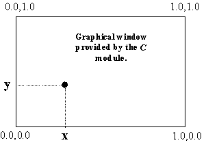
Note 1 : If the numbers used for passing a position to the graphical window have an integer type, then the position is calculated in pixels instead of relative coordinates. i10 = 10 pixels from the left side, i-10 = 10 pixels from the right side, etc.
Note 2 : The graphical window may be moved or resized just like any window. Once it has an appropriate size, it may be included into front panels or Image window as usual (see Creating front panels and Creating Image windows). |
|
 
|
Divides an initial graphical plane into 4 graphical sub-planes. Each sub-planes has its own coordinates system. |
|

|
Divides a graphical plane into successive horizontal sub-planes. The number of generated sub-planes is equal to the length of variable /u (the name can be changed as usual).
One drawing will be made in each sub-plane, corresponding to the different values along variable /u. This module allows to easily change a 1D view into a 2D view, or a 2D view into a 3D view, etc. |
|

|
Same as above, but divides the initial graphical plane vertically. |
|
|
Sets the color of the background of a graphical plane. |
|

|
Creates two identical superimposed graphical planes : allows to set the order in which different drawings should be made. |
|

|
Scrolls a graphical plane |
|
|
Creates a vector of graphical sub-planes depending on variable /t. |
|
Elementary drawing modules |
|

|
Draws a line between two points of the graphical window |
|

|
Draws a rectangle |
|

|
Draws a cross |
|

|
Draws a triangle |
|

|
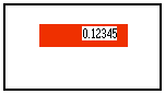
Displays a number at a given position in the graphical plane. The size of the module sets the number of digits of the displayed number. |
|
Mouse-sensitive reticules (see reticule options below) |
|

|
Draws a cross-like reticule in a graphical plane (see reticule options below).
A reticule is a mouse-sensitive cursors which returns one or several numbers depending on its position in the graphical plane (between 0 and 1).
The initial position of the reticule is set by changing the coordinates on the second line of the module. The module returns a complex number corresponding to its current position.
It can then be moved by the user by just clicking on it and using either the mouse or the arrow keys. The selected reticule is redrawn in red. All the results that depend on the returned coordinate(s) are automatically recalculated if possible.
Although reticules are not macros, they may be documented like macros : Ctrl+U to create an online help, Ctrl+H to see the online help.
|
|

|
Draws a horizontal reticule (see reticule options below). Returns a real scalar. |
|

|
Draws a vertical reticule (see reticule options below). Returns a real scalar. |
|
|
Draws a rectangle reticule (see reticule options below). Returns two complex numbers. Rectangle reticules may be moved by dragging a border, or resized by keeping the Shift key pressed while moving a border. |
Reticule options
In addition to the position indicated on the second line of the module, reticule modules may contain optional keyletters, entered after a "semicolon" (;) sign, that modify their behavior.
The available keyletters that may be entered after the ";" separator are :
|
Letter |
Meaning |
Function |
|
O |
Optional |
The reticule becomes visible only when the mouse cursor is in the graphical window and the user hits Shift+Ctrl. The reticule is not drawn when the graphical window is printed. |
|
l |
Left |
Specifies the left side as the reference position (see below) |
|
r |
Right |
Specifies the right side as the reference position (see below) |
|
t |
Top |
Specifies the top side as the reference position (see below) |
|
b |
Bottom |
Specifies the bottom side as the reference position (see below) |
If none of the l,r,t,b options is specified, the position of the reticule is handled as a relative position (numbers between 0 and 1). However, if an reference position (l ,r, t or b) is specified, the associated coordinate is now considered as an absolute position (in pixels) with respect to that reference position. The specified types of coordinates are kept when the reticule is moved with the mouse.
You may mix relative and absolute coordinates. If several absolute positions are set, specify their reference position in the same order in the option field (see examples below).
|
Example program |
Graphical window |
Comments |
|
|
|
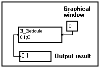
The position of the horizontal reticule is 10%, that is, 0.1 times the height of the graphical window, whatever its current size.
Due to the O option, the reticule becomes visible only when the user hits Shift+Ctrl while the mouse cursor is over the graphical window. |
|
|
|
The position of the horizontal reticule is 20 pixels from the top of the graphical window, due to the t option.
The reticule becomes visible as soon as the mouse cursor is over the graphical window (no O option specified). |
|
|
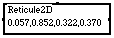
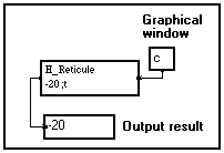
|
Mixed coordinates system : The position of the reticule is -25 pixels from the right border ¾ that is 25 pixels inside the window, and 80% of the height of the window. |
|
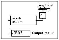
|
|
The initial position of this 2D rectangle mouse-sensitive reticule is set by mixing relative and absolute positions : one corner is located 20 pixels from the left border and 40% of the height. The other corner is located -30 pixels from the right border (that is, 30 pixels left from that border) and 60% of the height. |
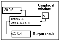
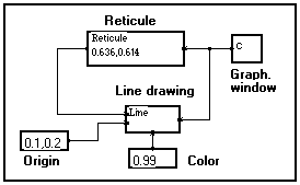
Example 1
: Drawing a line between two points
|
This simple program draws a green line (green color code = 0.6) between two points of a graphical window. If you right-click on the C module to calculate it, a graphical window named "C" opens and displays the result :
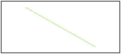
|
|
You may unlock (Alt+W) and rename (Shift+Ctrl+Click) the C module to change the name of the window. You may also resize the window : the line is automatically redrawn.
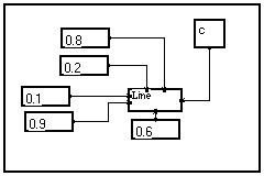
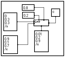
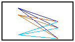
Example 2
: Drawing several lines at a time using vectors
|
Suppose you now want to draw a set of lines between points which coordinates are known. A solution is to use several Line elementary drawing modules, but there is a simpler solution.
A good starting point is the program in example 1. Thanks to MUSTIG's multidimensional facilities, you do not have to explicitly write a loop : just change the scalar input values into vectors depending on a given variable (/x here).
As both the variable name and its length are the same, MUSTIG automatically loops three times and displays the result as shown below.
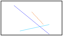
Note : Take a look at the two other examples below. They illustrate the effect of changing a scalar into a vector, or changing the variable names : very informative ! |
|
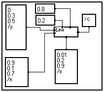
Example 3
: Drawing several lines at a time (2)
|
This program is adapted from the previous one. The only difference is that only two coordinates of the lines (Y1 and Y2) plus the color code input are vectorial, the two other inputs being scalar (X1 and X2).
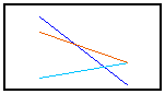
As a result, the horizontal position of the extreme points is the same for all the lines : MUSTIG loops only on the ordinates. |
|
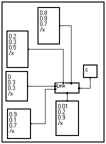
Example 4
: Drawing several lines at a time (3)
|
This time, the name of the variables on the two vectorial input pins is different. Thus MUSTIG knows that he must loop on all the existing combinations of samples from both vectors :
|
|
Example 5
: Drawing a line between a fixed point and a reticule
|
This program draws a red line (color code = 0.99) between a fixed point named "origin" and a mouse-sensitive reticule included in the window. Right-click on the C curve module to launch the calculation : a graphical window opens and displays the result :
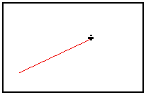
You may move the reticule : the line will automatically be redrawn. |
|
Reticules are very easy to define in MUSTIG language. They allow to create interactive control handles in graphical windows, in order to e.g. move axes or labels, spot peaks of a spectrum, etc.
Example 6
: Dividing a graphical plane into 4 sub-planes
|
This program divides an initial graphical plane into 4 sub-planes. The division point is entered as a complex number.
Three sub-planes are then used individually to draw a line, a rectangle, display a value.
The fourth sub-plane (upper left part of the window) is left unplugged as it is not used.
The result is shown below :
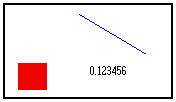
As an exercise, you could start from this example and modify it so that the division point is set by a mouse-sensitive reticule. |
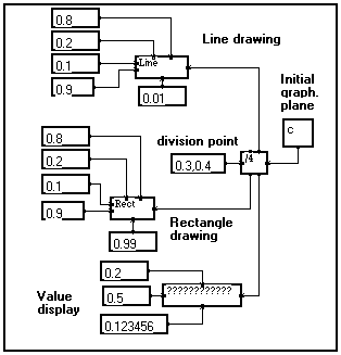
|
Note : This mechanism of dividing a graphical plane is widely used in Library viewing macros, e.g. to define the sub-planes in which axes, color scales, graduations, and curves should be drawn.
Example 7
: Dividing according to a variable - Viewing matrices of 1D curves
|
Suppose your data consist of a set of 1D signals (depending on variable /t for instance), each signal being referred to by two other variables (/x and /y for instance).
A good way of viewing these data is to display a matrix of 1D signals. Thanks to the modularity of MUSTIG, you may do this very easily from the standard View/t macro :
- Slide a View/t macro from the Library into your program window
- Double-click on the macro, then on its control panel to see the program (a). Click on it and unlock it (Alt+W)
- All we have to do to take both other variables /x and /y into account is divide the initial graphical plane horizontally according to variable /x for instance, and vertically according to variable /y. In order to do this, just modify the graph as shown on the right (b)
- MUSTIG then knows it must divide the graphical window into a matrix of graphical planes, and display a 1D curve in each sub-plane : one curve for each sample on variable /x and /y.
- Rename the macro into MatView/t/x/y, so that the variable names can be changed from the front panel to adapt to other situations.
Thus, it is very easy to modify an existing viewing macro to add one or two dimension and create custom viewing macros. |
(a)
Original View/t macro
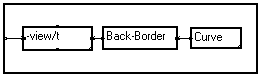
(b)
Modified View/t macro
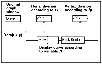
(c) - Result : a matrix of 1D signals
(d) - Renamed module

|
Example 8
: Superimposing graphical elements
|
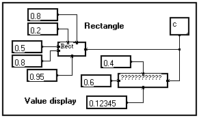
You may connect several drawing operators to the same graphical plane. However, as the order in which the different drawings are made cannot be enforced, the obtained results may not be what you expected.
The first program on the right (a) draws a rectangle and displays a value. As the order is not specified, the value may as well be hidden by the rectangle if the latter is drawn after displaying the value.
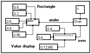
If you want a drawing to explicitly be made over the other ones, you must specify it by including the Over module in your program.
In the modified version of the program (b), the value is explicitly drawn over the rectangle :
Note : Following the same principle, you may define a vector of ordered, superimposed graphical planes according to a variable, using the Superimpose/t elementary drawing module. This allows to create animated views.(a) - No order specified
(b) - Modified version
|
|